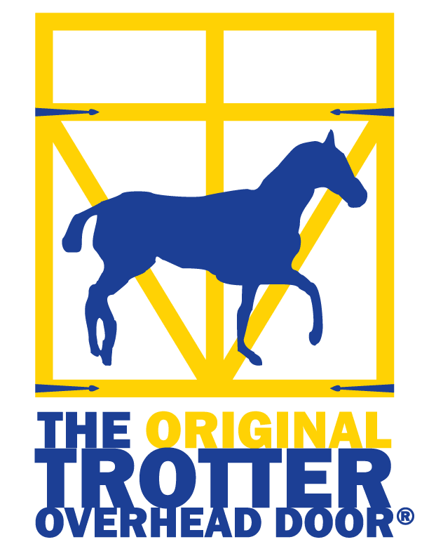
The client is a local installer and dealer of overhead doors. They are one of several businesses using the Trotter name and wanted to distinguish themselves from the competition. Their old logo was a hand-drawn, amateur affair that existed only as a 4th generation photocopy, but there was a germ of an idea in it — the ‘trotter’ horse — that we felt was worth preserving. Crude as it was, the old logo was familiar to their existing customer base, and also it was a nice visual pun on the company name. Here is the redesigned logo.
- Trotter Logo (Color)
- Trotter Logo (Greyscale)
- Trotter Logo (Monochrome)
